It’s always a good idea to brush up on your design skills from time to time. Whether you are a beginner or someone with no designing background, there’s no such thing as too much knowledge. So we created this article with 12 practical graphic designing tips that beginners and non-designers alike can use right away. Check them out below.
Keep it simple.

To design a great product, work on keeping it simple by utilizing your inner minimalist. You can create an aesthetically pleasing and easy-to-follow layout with fewer distractions and avoid unnecessary embellishments.
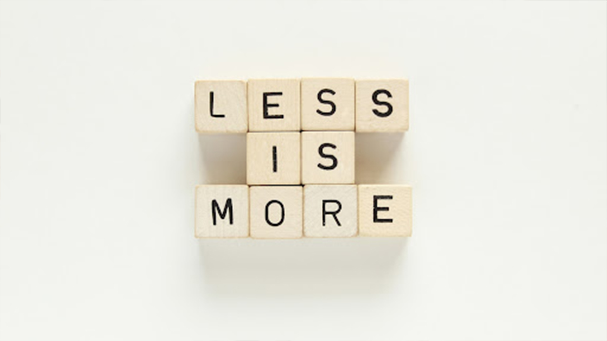
Remember that less is more.

Many designers mistake cramming in as many graphics and elements into their designs, thinking that more is better. But this leads to a cluttered design with no aesthetic appeal or clear message. Instead, achieving a balance between an aesthetically appealing design should be the priority for any designer looking for potential clients.
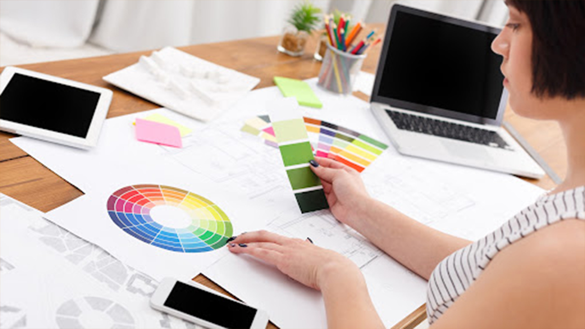
Use a cohesive color palette.

Color palettes and color schemes can make or break a design. Choosing the right colors for your product, service, etc., is always essential to creating an aesthetic that will resonate with consumers. But not all designers are proficient in playing with the color palette. The Adobe Color website offers several unique tools for extracting perfect colors from any image at just the click of a button.
Also Read: 10 Tools To Be A Successful Graphic Designer
Keep the typography under control.

Font selection is an exciting and artful way of expressing the creativity in you. It’s a skill that every designer should have on their resume but also one that anyone can enjoy creating something unique with just some imagination.
If you are looking to make your text more interesting, one easy solution is using different fonts. One rule of thumb is if you want the font for headings and preliminary information a little fancier, then all other text can be done with two or three weights from within just one standard font family. For example, use a Montserrat bold in place of writing headlines while body content should stay regular-weighted and italics used sparingly throughout this guide on when they would work best.
Consider the visual hierarchy.

Visual hierarchy is all about how to display various optical elements in order of importance. The larger or brighter an aspect, the more attention it will be given by viewers, which can lead them on a path through your information design. When you use these tips when doing graphic designing, specific points are emphasized and highlighted with other contrasts that help people understand where they need to go next for the content’s sake.
Save time with social media templates.

Graphic designing for social media needs to be done constantly and regularly. There is no better way than using pre-designed templates available in every channel, with any size you require. Social Media Managers have a lot of work on their hands because they manage so many different media with various sizes – but thankfully, there’s an option for all your needs when it comes to template use.
Always use white space.

White space is where text or elements are not present. It provides breathing room and helps to keep your eyes focused on what you want them to be looking at, but it can also make an element seem more critical than it might otherwise if there was no white space around it. The best way to learn how to use this technique effectively is by studying minimalist designs that rely heavily on negative whitespace for emphasis while still pleasing aesthetically with only minimalistic colors and shapes and reading about its function.
Use cohesive design elements.

Designers need to consider the overall aesthetic of a project when adding new elements. Make sure that all graphics are cohesive in style, such as using line icons instead of mixed 3D and lined ones or mixing rounded squares with other curved shapes within one color scheme. These tips will help keep your graphic designing look at best while also being more intuitive for users by tying disparate parts together into an integrated whole.
Optimize readability.

The best way to make your text easy to read is by using a typeface that goes well with the message of what you’re writing. It should be readable over any background image or texture, including color and font choices for headings and how elements flow around it in the design. When designing a project to avoid confusion about its context, do everything within your power- textual content and visualizations like charts are equally important.
Make good use of spacing.

It’s not just about keeping your lines straight and even; spacing is what makes any design come alive. Knowing the right balance, you can create spaces between letters, margins around graphics that you add to an article. Without them, every piece of art would look like they were thrown together without care. It can sometimes feel tedious trying, but good spacing helps everything else fall into place. Therefore, don’t underestimate its importance when designing logo designs for company brochures.
An infographic can be of any size.

Infographics are at the very heart of design, and it is essential to understand that not all infographics need to look a certain way. Different infographic formats depend on what’s the content requirement to visualize or the place of its publishing. For example, long vertical ones explicitly made for blog posts have been cut into blocks and placed throughout text articles to show how they work together with one another effectively.
Consider the psychology of color.

The color of your design can make a big difference in how you connect with others. When choosing colors, think about what every option represents to people, their cultures and the emotions evoked. You’ll want to be aware of these things if you’re trying to convey certain feelings through an emotional connection.
Know the dimensions you need beforehand.

If you’ve ever had to scale a project down, then you know how important it is to have the correct dimensions. When working on your presentation or set of Instagram posts, two measurements are key: size and aspect ratio. Size refers to length and width (in pixels) and height when square images are desired. An image’s aspect ratio is its relationship concerning these sizes- i.e., if one dimension has twice the value as another).
Conclusion
After reading this post, you should now understand the various graphic designing tips and build your identity. The next time you need to create an image or logo for your business, don’t hesitate to refer to these essential tips. You can always talk with our professional designers at Out Origin. Let us know what you think – we are here for any questions and consultations.


